By William Hertling
Web strategist, software developer, and science fiction author. Follow him at @hertling.
Introduction
In my last tutorial I showed how to use print-specific CSS to format web content for print. In that example, I used an HTML-to-PDF tool called PrinceXML to do the conversion. There’s lot of cases where it makes sense that web content would be printed: an off-line copy of an article, a coloring page for a kid, or to print a document or spreadsheet.
But HTML-to-PDF workflows are also useful for non-web content. Maybe you have an local store, and you’ll like to print a flyer of your on-sale inventory. Or perhaps you’re generating a centralized report. In these cases, you have something that is data-driven, but not necessarily sitting on the Internet as a webpage. Or maybe you’re doing custom content assembly, such as a cookbook that excludes recipes the customer is allergic to, or a textbook that incorporates specific chapters selected by the professor. (For many more great examples, see PrinceXML samples.)

Books have rigorous print design requirements.
We’ll use one as our example to show how to format content for print using HTML and CSS.
Why use HTML at all in that case? There are several tools that can help solve this problem: pandoc, TeX, LaTeX, RTF. But if you’re an engineer like me, HTML and CSS are technologies you use on a daily basis. Rather than learn something archaic like LaTeX, you can use modern technology you’re comfortable with and skilled at using.
By day, I’m an engineer, but by night, I’m a science fiction writer. So I’m going to show how I converted one of my book manuscripts into a print-ready PDF for one of paperback books. Books have some of the most rigorous design requirements, so if you can layout a book, you can layout almost anything.
In general, the approach requires you to:
- Write print-specific CSS incorporating print design principles (e.g. serif fonts, multi-column layout if appropriate, hyphenation, page headers and footers).
- Generate HTML, either by outputting from another program, or by creating the markup yourself based on the underlying data.
- Generate the PDF by using PrinceXML or wkhtmltopdf, supplying the source HTML and CSS files.
I’m going to focus primarily on the specifics of CSS that are particular to laying things out on the printed page.
Page Setup
Here is the CSS that sets up the page size and margins.
@page {
  size: 6in 9in;
  margin-inside: 0.75in;
  margin-outside: 0.625in;
  margin-top: 1in;
  margin-bottom: 1in
}
The size is self-explanatory, as is the top and bottom margins. However, rather than use left and right margins, we’ll use inside and outside margins. This is important for any bound book. The inside margin needs to be slightly larger than the outside margin because the binding itself, and the curve of the page around the binding takes up space. At this time, only PrinceXML supports inside and outside margins, which you’ll need for any bound book.
It’s worth noting that if you just want landscape orientation, and don’t care about the dimensions of the page itself, you can use “size: landscape;”.
Header and Footer
Book layout is interesting, because the page numbering is usually located on the outside of the page (so right side on odd pages, and left side on even page), and the headers are different on left and right pages. In addition, different parts of the book require different headers and footers.
First, notice this CSS selector:
div.book-main {
  page: book-main;
  counter-reset: page 1
}
The page: book-main; line says that any pages that have a div with a class of book-main get a page type of “book-main”, and that the first time this div is encountered, the page counter is reset to 1.
This CSS then styles those pages:
@page book-main:right {
  @top {
    content: "William Hertling";
    font-family: "Palatino";
    font-size: 11pt;
    color: grey;
  }
  @bottom-right {
    content: counter(page);
    font-family: "Palatino";
    font-size: 11pt;
    color: grey;
  }
}
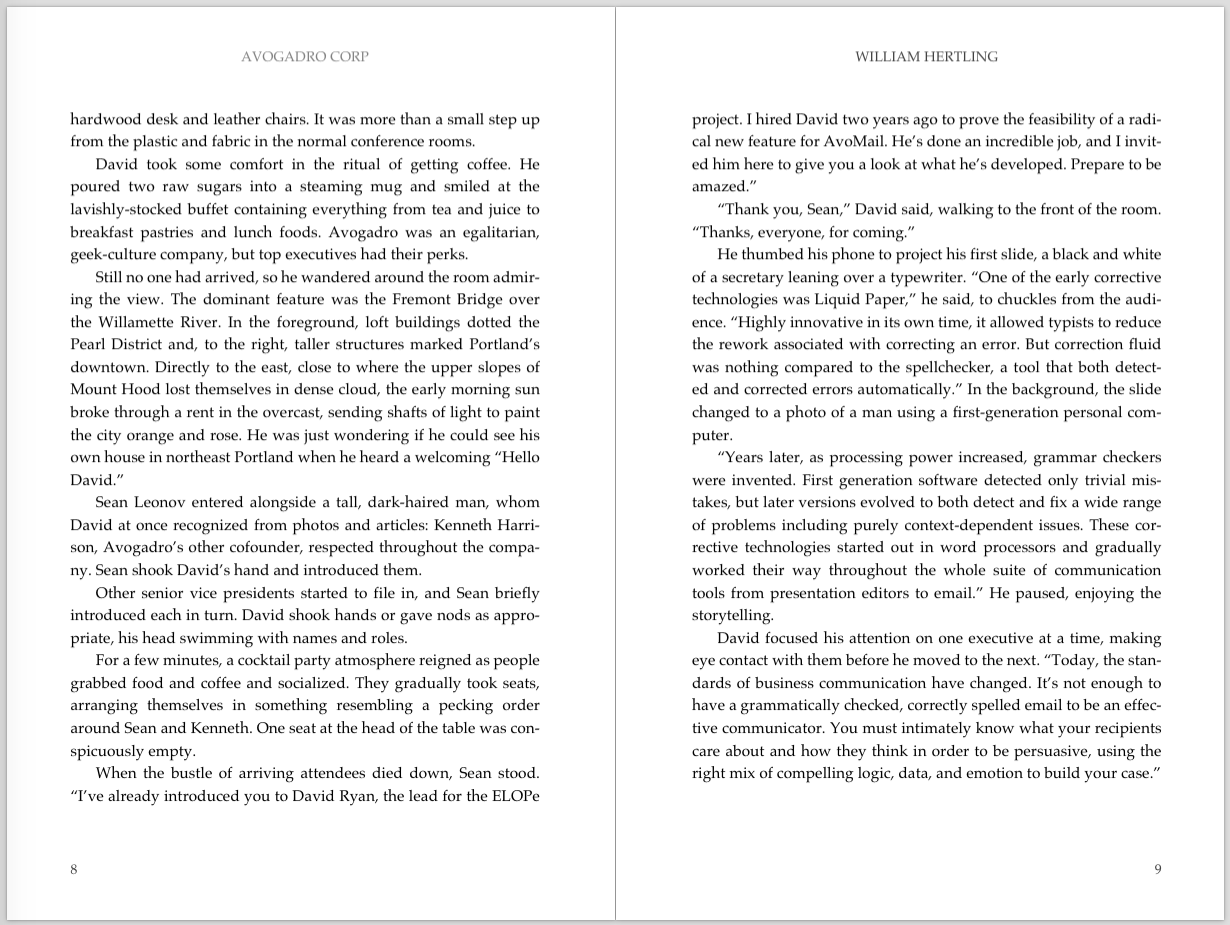
As you can see, the @page element takes a CSS selector, but it also supports a pseudo-class of “left” and “right”. The left page gets one header, and the page number is put on the left. The right page gets a different header, and the page number is put on the right. Here’s what the headers and footers look like:

Figure 1: Example of header / footer layout from CSS.
However, the above CSS isn’t quite enough, because blank pages that occur within the book-main div are treated differently. They get neither header nor footer:
@page book-main:blank {
  @top {
    content: ""
  }
  @bottom-left {
    content: ""
  }
}
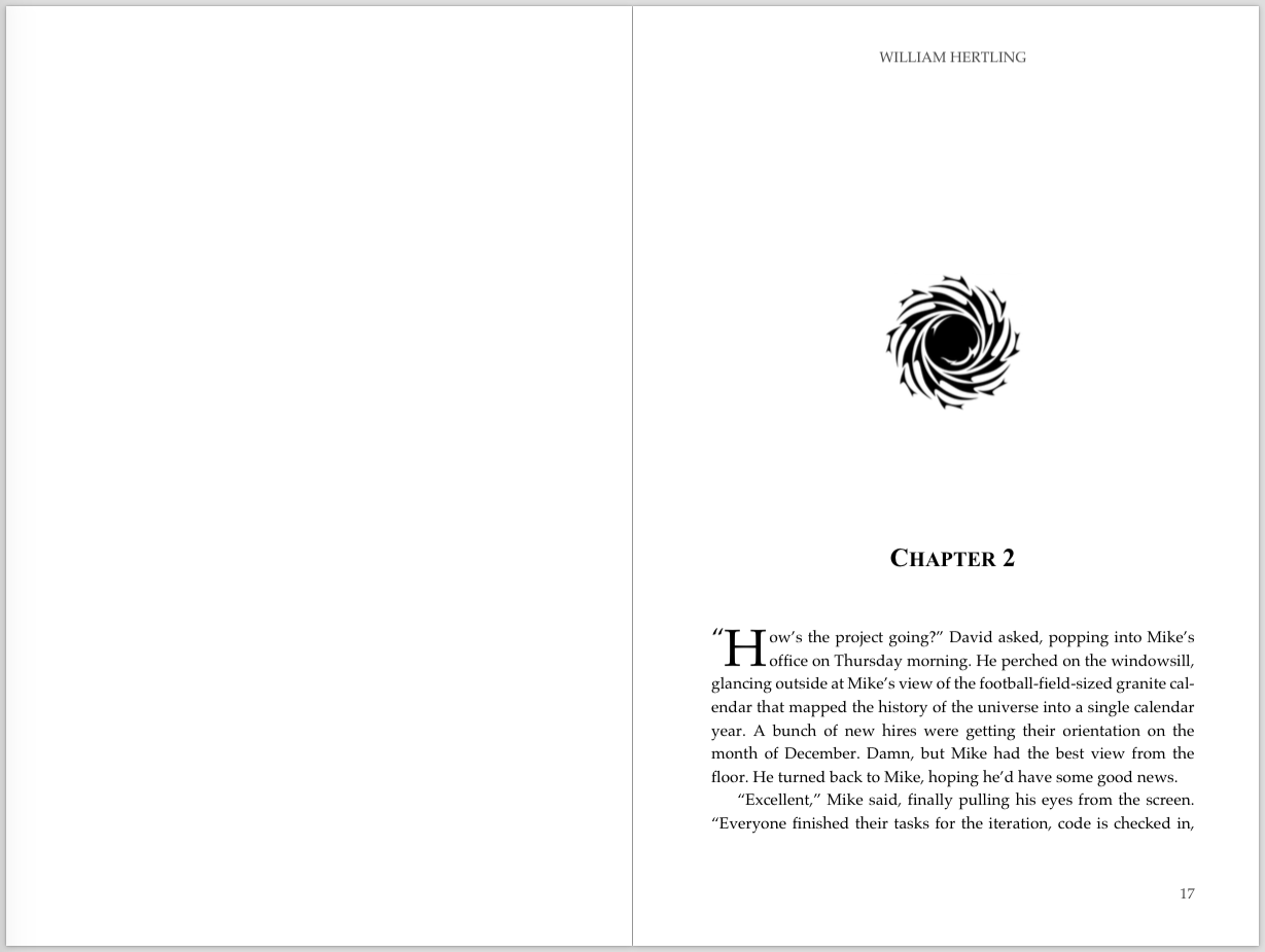
And this example shows how the header and footer get suppressed when there is a blank page (as can happen when a chapter starts only on the right-hand page):

Figure 2: Example shows suppressed header and footers
as well as right-hand start to chapter.
At this time only PrinceXML has complete and robust support for the margin boxes CSS, although most of the above behavior can be simulated in wkhtmltopdf using Javascript and their own proprietary support for headers and footers.
Whew! That was a lot of margin box work.
Chapters
As demonstrated in the last two-page spread (Figure 2), chapters have some special formatting requirements:
- There's always a page break at the start of a chapter.
- Many books are laid out so that each chapter opens on the right-hand page. It's not an absolute necessity though, and it's often skipped in books with many chapters. My third novel, The Last Firewall, has 80 chapters, and if we had used right-hand start, it would have added about 40 extra pages, driving up the cost of the printed book about 15%.
- The actual text starts part-way down the page. Again, this is a design choice, but a quick perusal of the books on my shelf show many starting about two-thirds of the way down (more traditional), half-way down, or a quarter of the way down.
- There's a chapter title, and it gets special formatting.
- There may be a decorative element.
I'm going to talk about the formatting of the body text and initial dropcap in the next section.
For context, here's a rough idea of what the HTML for a chapter looks like:
<div class="chapter">
  <div class="chapter-open-image-container">
    <img src="images/chapter-open.jpg" class="chapter-open-image"/>
  </div>
  <h1 class="chapter-title"><b>Chapter 7</b></h1>
  <p class="first-paragraph"><span class="opening-quote">“</span><span class="drop-cap letter-m">M</span>ike, I hope your dad is okay....I’m worried about ELOPe. I’m going to be somewhat incommunicado while we’re at Christine’s parents’ place, but keep trying me.”</p>
  <p>David hung up and looked over to where his wife waited with their suitcases....</p>
</div>
I've shortened it up, but you should get a basic idea of the structure. Now for the CSS.
This handles the page breaks by indicating that a page-break should occur when a chapter is first encountered:
.chapter {
  page-break-before: right;
}
If it's okay for a chapter to start on either page, then simply use:
.chapter {
 page-break-before: always;
}
Next we position the decorative image on the page:
div.chapter-open-image-container {
  padding-top:1.5in;
  margin-left: auto;
  margin-right: auto;
  width: 96pt;
}

img.chapter-open-image {
  max-width:100%;
  max-height:100%;
}
It took me a bit of playing around to get the image to display correctly. I find images and CSS to be a bit confusing, so it's possible the above CSS could be improved.
Finally, the chapter title is placed:
h1.chapter-title {
  padding-top: 1in;
  text-indent: 0.0in;
  font-size: 18pt;
  text-align: center;
  margin-bottom: 0.5in;
}
Since the default text-indent is set somewhere else to indent the first line, it's necessary to reset the text-indent to 0 as shown above to get a line that's truly centered on the page.
Maintain visual alignment of the body text across the left and right pages and front and back of a page is very important. I'll come back to this topic in the next section on body text. But for the moment keep in mind that the full size of all of the above elements must add up to a multiple of 16 points.
Body Text
Reading the body text of a book is where the customer spends most of their time, so there are important design choices to be made here. I'll discuss five topics in this section:
- basic choices for good readability
- hyphenation
- widow and orphan control
- visual alignment of lines of text
- drop caps
Here's an enlarged version of the body text for reference:

Figure 3: Chapter opening text
The basic design elements that enhance readability on the printed page include: a traditional, serif font, generous spacing between lines to make it easier for the eye to track, and using justified (aka fully justified or flush) text in which the right side of the text forms a straight vertical line. However, justified text only looked good if hyphenation is used to break particularly long words to avoid awkward spacing on a line. Paragraphs are indented, except for the opening paragraph of a chapter (as well as opening paragraphs of additional scenes within a chapter).
All of this is achieved with the following CSS:
p {
  text-align:justify;
  font-family: "Palatino";
  font-size: 11pt;
  text-indent: 0.25in;
  line-height: 16pt;
  margin-top: 0pt;
  margin-bottom: 0pt;
  hyphens: auto;
  prince-hyphenate-lines: 2;
  prince-hyphenate-before: 3;
  prince-hyphenate-after: 2;
  orphans: 2;
  widows: 2;
}
The font family is Palatino, a very nice book font. One thing to note is that the sizes are mostly expressed in points, which is what's traditionally used for print, and represents 1/72nd of an inch. The font size is 11 points, while the line spacing is 16 points. That gives us the right amount of space between lines to make for easier eye tracking. The text-indent is for the first line of paragraphs.
All of the CSS attributes above "hyphen" are broadly supported by all web browsers, wkhtmltopdf and PrinceXML. At the time I worked on this project in 2014, only PrinceXML properly supported hyphenation. Since then, I've seen messages in wkhtmltopdf forums indicating that support for hyphenation is being added, but I haven't personally used it. Hyphens: auto; turns on hyphenation, and the Prince-specific directives control when to hyphenate.
The final two lines address orphans and widows, which are when either the first or last line of a paragraph is alone on page, with the rest of the paragraph on either the previous or next page. Orphans and widows affect readability. Fortunately, PrinceXML supports widow and orphan control. The final two lines of the above CSS declares that a minimum of two lines of a paragraph must be together. In the case of first line alone, PrinceXML will move it to the next page. In the case of last line alone, PrinceXML will move the previous line to the current page.
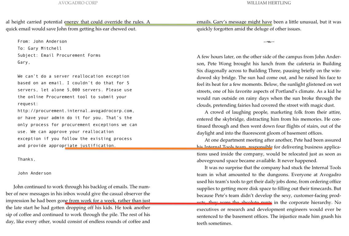
Now let's change gears and look at visual alignment of lines. Here's an example of visual alignment gone bad:

Figure 4: Line alignment gone wrong.
Alignment is good at the top, then becomes bad at the bottom.
(This will drive designers and those with OCD insane.)
In the example above, we can see that the two pages start out in alignment. Then the left hand page contains a section of email, and the alignment is off, as we can see with the orange line. And the alignment is still off when we get to the red line. When the alignment is off, it looks bad, but it also can cause visual fatigue if the text from the back side of the page is visible through the page.
Why did that happen? There was an error in the original CSS code:
div.email, div.news {
  margin-top: 12pt;
  margin-left: 0.375in;
  margin-right: 0.375in;
  margin-bottom: 12pt;
}
The "email" was formatted with top and bottom margins of 12 points. But our body text has a line-height of 16 point. When we encounter the top-margin, the left page is suddenly 4 points off the right page. After we encounter the bottom-margin, the left page is 8 points off the right page. To maintain alignment, everything must happen on at the same interval as the line-height, which we set to 16 point. So any images, margins, open space, or special text must be specified such that it is positioned on 16 point boundaries. For the email example, it would be acceptable to have a top-margin of 16 points, but not 12 points. The last piece I want to discuss are drop caps. Marking the start of text with a large letter dates back 2,000 years to hand-lettered manuscripts. It doesn't have a large impact on readability, but it looks nice and increase the sense of quality by a reader. Implementing it perfectly with HTML and CSS is a bit tricky. The Smashing Magazine article describes a variety of approaches. The easiest approach, which is to use the pseudo-selectors first-child:first-letter is tempting, but doesn't work correctly when the paragraph starts with a quote, like in this example:

There's three things going on there: the opening quote, the big letter H, and then the rest of the paragraph. Here's what the HTML looks like:
<p class="first-paragraph">
  <span class="opening-quote">“</span>
  <span class="drop-cap letter-h">H</span>ow’s the project going?” David asked,
  popping into Mike’s office on Thursday morning. He perched on the windowsill,
  glancing outside at Mike’s view of the football-field-sized granite calendar
  that mapped the history of the universe into a single calendar...</p>
And here's the CSS to achieve that:
span.drop-cap {
  float: left;
  font-weight: 500;
  font-size: 36pt;
  line-height: 30pt;
  padding-top: 2pt;
  padding-right: 1pt;
  padding-left: 0pt;
}

span.opening-quote {
  float: left;
  font-weight: 500;
  font-size: 18pt;
  padding-top: 1pt;
}
I didn't make use of it, but you'll notice that the span containing the drop-cap letter contains both the drop-cap class, as well as a letter-specific class. This was in case I needed to address the spacing around the letter, as described in the Smashing Magazine article. I didn't use it, but it's there just in case.
By the way, the HTML didn't start out with that structure. I had to parse the source HTML with ruby and nokogiri to get it exactly the way I needed. The full scope of HTML parsing is outside the scope of this article, but here's the ruby code to wrap the opening quote and first letter with the appropriate spans:
def self.mark_drop_caps
  first_paras = @doc.css "p.first-paragraph"
  first_paras.each do |para|
    if para.children.size > 1
      record_error "mark_drop_cars [error]: not expecting multiple children on line #{para.line} for content #{para.content}"
    end
    text_node = para.children[0]
    # deal with opening quote
    if ['"', '“'].include? text_node.content[0]
      quote_span = Nokogiri::XML::Node.new "span", @doc
      quote_span['class']="opening-quote"
      quote_span.content = text_node.content[0]
      text_node.add_previous_sibling(quote_span)
      text_node.content = text_node.content[1..-1]
    end
    # mark drop cap
    drop_cap_span = Nokogiri::XML::Node.new "span", @doc
    drop_cap_span['class']="drop-cap letter-#{text_node.content[0].downcase}"
    drop_cap_span.content=text_node.content[0]
    text_node.add_previous_sibling(drop_cap_span)
    text_node.content = text_node.content[1..-1]
  end
end
Conclusion
This article started out by talking about the context for using HTML and CSS to generate PDFs for content that does not originate as a web page, such as a book, brochure, product catalog, or other custom content.
Since I have experience laying out a print book using HTML and CSS, that's the example I used. But the approach can be leveraged to any content you'd like to format for print.
The article showed how to set up our page size, orientation, headers, footers, and page numbering. I covered how to format a chapter, which involves controlling where page breaks occur, the positioning of image elements on the page, and starting the text at a given location. Finally, I showed how to format the body text, which is relatively simple, but has big implications for readability. And closed with drop caps, which is a nice visual element that readers expect and which adds to the perceived quality of the printed material.
Hopefully this article demonstrated the power of using HTML and CSS to create printed materials. If you can do it in InDesign or LaTeX, you can also do it in HTML and CSS. The power of doing it in HTML as compared to InDesign is that it can be fully automated. The advantage over LaTeX is that HTML and CSS are familiar and comfortable to most modern programmers.
I talked a lot about PrinceXML, but I have no association with them, financial or otherwise. I simply like their product. You can do 90% of what's shown using wkhtmltopdf, although it may require some tweaks. If you enjoyed the article or have requests for future ones, please let us know in a comment!
William Hertling
William Hertling is a web strategist, developer, and blogger at HP. When he's not slinging code, he's writing science fiction or raising his three kids.
More from Will
Code Tutorials
Here are Will's detailed code tutorials that we have migrated to Print Fundamentals for Developers on the HP Developers' Portal
Will's blog and forum posts
- Printing from a web app directly to a printer
- Selecting regions of a webpage to print
- Printing HTML headers and footers
- Web printing in landscape
- In-browser preview of print CSS
Thanks for the kickstart, Will. We will preserve your open, egalitarian spirit as we support and grow the Print Developer Community on the HP Developers' Portal. We will be looking for you in the Forum.
The Skipper


